Take your business card out and place it in front of you. How does it look? If someone handed it to you, would you say, “Wow, who did this for you?”
Are you thinking, “Who cares? It’s only a business card.” My answer is simple. I care. You should, too. Your card is the most visible piece of marketing material you have.
Don’t deny it. Your card is dull and boring. Worse, you don’t know how to fix it and you don’t want to invest money hiring a graphic artist. But fear not – help is on the way for a measly $22.00 – plus a few hours of your time to read the book and think creatively.
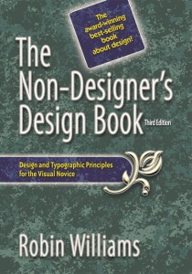
Robin Williams (the author, not the comedian) has written a short, concise (208 pages) book called The Non- Designer’s Design Book. This guide will change forever the way you look at printed material. Williams writes for people without a design background BUT who still want their material to look more organized, unified and interesting. In other words they don’t want their materials to look boring! The book is based on four simple principles:
- Contrast
- Repetition
- Alignment
- Proximity
For those of you who need triggers to help you recall such principles, you can create a memorable – if slightly inappropriate – acronym using the first letter of each word.
Contrast adds interest to a page, but for contrast to be effective, it must be striking. If I change the font in this sentence from 14 to 16 points, do you really see much of a difference. Or does it seem like I made a mistake? However, if I go from 14 to 20 points and bold the copy, you see a difference. Contrast is crucial to the organization of information. A reader should be able to glance at a document and instantly pick up the important points.
Repetition means just that – repeating some aspect of the design throughout the entire piece. This could be a bold font, a thick line, color or anything the reader will recognize. Think of repetition as being consistent. Consistencies that repeat throughout all your pieces – from business card to brochure to website – help people remember you.
Alignment refers to where you place text or graphics on a page. I recommend avoiding centering everything. Use left or right alignment.
Be careful not to mix alignments and always tie elements to something else on the page. When ideas are not aligned the page looks messy. (Kind of like your office is now. Think how much better you feel and function when everything is clean and organized.) Proximity (closeness) organizes your page.
Proximity and alignment compliment each other. Squint your eyes and try to count how many elements are on your business card or a page. If the elements are similar they should be moved together to provide more white space and increase the page or card’s attractiveness. Only use white space between elements if they are dissimilar. Do your best to avoid sticking design elements in the center of the page.
Each of these principles is separate but all of them are interconnected. You’ll see what Williams means if you read the book because she shows many examples of good and bad layouts! These ideas are solid and will help you create attractive pieces guaranteed to help your business grow and shine.
I especially liked Chapter Eight, entitled Extra Tips and Tricks. This chapter gives examples of business cards, letterhead and envelopes, flyers, newsletters, brochures, postcards, newspaper ads and even websites.
The second part of the book goes deeper into proper font choice and styles. These decisions play a huge part in how your finished pieces look. Examples prove how even small changes in font or style can make the page come alive.
A quick search on Amazon.com for consumer comments showed 229 reviews with an average score of Four and a half Stars of Five. Pick up a copy for $21.77 on Amazon and watch how quickly your material improves.
Next time you hand someone your business card and they say “Wow, who did this for you?” Just smile and thank Robin Williams and Bill Yeadon!
